A Guide To Pest Control Logo Design
Creating a strong brand identity in the pest control industry involves more than just offering excellent service; it requires building trust and recognition among customers. A professional logo serves as the foundation of this identity, providing a visual cue that immediately communicates your business’s values and expertise. A well-designed logo can help you stand out from competitors and build a lasting impression, whether it’s displayed on marketing materials, service vehicles, uniforms, or your website.
In the pest control sector, where trust is crucial, your logo can be the first point of connection with potential customers. It plays a critical role in establishing professionalism and reliability. When your logo appears consistently across various platforms, it not only promotes brand recall but also fosters trust, making customers more likely to recommend your services based on their perception of your business.
A great pest control logo doesn’t just look good—it serves as a tool for business growth. Logos are often featured prominently on trucks, social media profiles, and advertisements. As a result, the design needs to communicate your business’s key qualities, such as promptness, effectiveness, and eco-friendliness, in a matter of seconds. Colour choices, typography, and imagery all contribute to making your logo memorable and effective in attracting new customers(
Starting Your Logo with a Good Foundation
Before diving into colours, fonts, and imagery, it’s essential to build your logo design on a solid foundation that reflects the unique personality of your pest control business. A logo should be more than just a graphic—it should encapsulate your brand’s essence, values, and what makes your company different from competitors.
Understanding Your Company’s Unique Qualities
Start by identifying the distinct elements that set your company apart. Does your business focus on eco-friendly pest control solutions? Do you pride yourself on fast, emergency services? Are your customers mainly residential or commercial? Knowing these details will inform every design decision, from the colours you choose to the type of imagery that will resonate with your target audience.
For example:
- Eco-friendly companies might lean toward greens and nature-inspired imagery to communicate their environmental focus.
- Emergency pest control services could opt for bold reds or oranges to signal urgency and fast response times.
- Family-oriented businesses might use softer, friendlier imagery and fonts to convey safety and approachability.
The Importance of a Branding Questionnaire
Before starting your logo design process, conducting a branding questionnaire is a critical step. This questionnaire helps instill your business’s core values, target audience, and desired brand perception into clear, actionable insights. It ensures that your logo aligns with your company’s mission and long-term goals.
Some important questions to ask include:
- What are your company’s primary services?
- Who is your target audience?
- What are the key messages or emotions you want your logo to convey?
- Are there any colours or symbols that align with your business values?
- What logos in your industry do you admire, and why?
- By answering these questions, you create a strong foundation that guides your logo design in the right direction from the start
Ready to discover your business’s unique brand personality? Start by filling out our Branding Questionnaire to ensure your logo reflects everything that makes your pest control company stand out.

Bold Colour Choices and Creative Symbols
Being a pest control company doesn’t mean you always need to use a typical symbol like a shield or a bug. Sometimes, your logo can reflect your unique selling proposition (USP) and communicate professionalism, friendliness, or trustworthiness. This is where a branding questionnaire becomes invaluable—it helps designers understand how you want your brand to be perceived by your customers.
In this case, the symbol doesn’t depict a bug. To me, it looks like a fist pump, which expresses a “we’ve got you” vibe. This conveys trustworthiness, success, and solidarity, fitting perfectly with the message that Aspect isn’t just providing a service—they’re actively solving problems and offering support. This approach builds trust and reinforces reliability.
The Font
The logo uses a bold, rounded sans-serif font. This font style conveys friendliness, approachability, and modernity. The rounded edges suggest a customer-focused approach, while the boldness communicates strength and reliability—two essential qualities for a service-based company like Aspect.
Its readability is key: the simple, clean lines ensure the font remains legible, even from a distance or on moving objects like vehicles. This makes it ideal for branding on materials like signage and business cards.
Colour Scheme
The neon yellow and dark blue combination creates a striking contrast that grabs attention. Yellow conveys warmth, optimism, and energy, while blue signifies trust, professionalism, and stability. Together, these colours provide a balanced brand identity that feels reliable yet dynamic. The neon yellow is especially effective for catching attention on vehicles and outdoor branding, making it perfect for quick recognition.
This refined version is straightforward yet informative, highlighting the key elements of Aspect’s branding.

Going Against The Grain
The Active Pest Control logo uses a combination of elegance and professionalism to differentiate itself in the pest control industry, a sector typically dominated by more rugged, bold designs. Here’s a breakdown of the key elements:
1. Regal Design Elements
- Crown and Crest: The inclusion of a crown above the letter “A” immediately gives the logo a sense of authority, class, and prestige, which is less common in the pest control industry. This suggests that Active Pest Control wants to position itself as a premium, trustworthy service, perhaps appealing to higher-end residential or commercial clients.
- Swirling Ornamentation: The ornamental flourishes on either side of the central “A” add a touch of sophistication and refinement. These details communicate a high level of care and attention to detail, reinforcing the idea that the company provides an exceptional, above-standard service.
2. Typography
- The serif font used here is classic and elegant, which further complements the regal elements of the design. Serif fonts are often seen as more traditional and formal, suggesting that Active Pest Control values professionalism, experience, and trustworthiness.
3. Colour Choices
- Gold and Black/White: The logo features a gold tone, which is typically associated with luxury, success, and high value. This reinforces the idea that the company provides a premium service. The use of black as the background in one variation adds a sense of sophistication, while the white background option keeps the design flexible and suitable for a variety of branding applications.
Pros
- Unique in the Industry: By adopting a regal and elegant style, this logo breaks away from the usual imagery of shields, bugs, or pest control tools, making it memorable and distinct.
- Appeals to Premium Clients: The design choices suggest that Active Pest Control may be targeting high-end clientele who value quality and expertise over price alone.
Cons
- Might Not Be Instantly Recognisable: Without the typical pest control imagery, potential customers may not immediately understand the nature of the business from the logo alone. However, this could be mitigated with strong branding and communication elsewhere.

With a brand like Active Pest Control, it’s crucial to ensure that the sense of elegance, professionalism, and regality is consistent throughout all branding elements. This ensures that the high-end, premium image conveyed by the logo is reinforced at every customer touchpoint. In this case, their website makes a great first impression, particularly with its design above the fold, where the overall look and feel of the brand immediately reflect the same sophistication and attention to detail seen in the logo. This seamless brand experience helps build trust and aligns with the elevated service level the company aims to provide.
DigiXCentric
")
We’re Bec and Jamie, your go-to digital marketing duo! With years of experience in graphic and web design, we specialise in helping businesses like yours grow and thrive. Whether you need marketing support, design solutions, or a fresh approach, we’re here to bring your ideas to life with a personal touch.
More on Pest Control…..
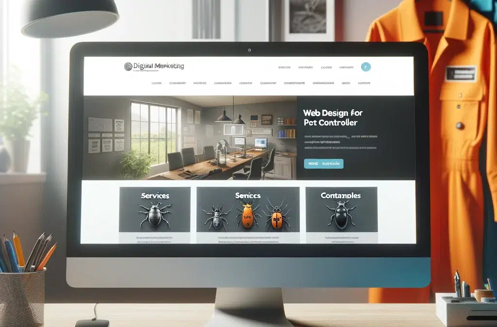
Pest Control Website Design
The Ultimate Guide To Pest Control Website DesignAs a pest controller, having a strong online presence is crucial for attracting and retaining clients. Your website serves as the digital face of your business, showcasing your expertise, building trust, and driving new...

Pest Control Branding
Mastering Pest Control Branding for Market SuccessBranding done well is like saying to a customer "Here, we want to make it easier for you to remember us, to get a good vibe from us" It's the first step to customer service in many ways. It's how you dress, present...
Core Elements of an Effective Pest Control Logo
This post analysis real life logos. We dive into what we like and hopefully this will give you some brain storming to think about logos and branding. If you’re looking to understand logo design more intensively visit our post on logo design expertise. Below we talk a little more about the typical elements of logos in pest control world.
Symbols used in pest contol
The Shield in Pest Control Logos: Pros and Cons
The shield is one of the most common symbols in pest control logos due to its association with protection and safety. It instantly conveys that your company will protect homes and businesses from pests. However, while it’s a familiar and easily recognisable symbol, it also comes with drawbacks.
Pros:
- Instant Recognition: Customers quickly associate the shield with defense and protection, which is essential in pest control.
- Trust and Security: The shield’s historical connotations of strength and reliability reinforce the idea that your business is dependable.
Cons:
- Overused: The shield is so common in the industry that it risks making your brand look generic and harder to differentiate from competitors.
- Limited Creativity: Relying on such a widely used symbol can stifle the opportunity to present a unique brand identity.
Want to break free from typical pest control symbols and create a logo that stands out? Explore how we can help you design a logo that’s both creative and effective. Learn more about our custom design services.


